Art Gallery Companion Mobile App
A GV Design Sprint
The Problem
The in-person museum visit is one of the most important ways people can engage with and appreciate world culture and art. However, many visitors express a dissatisfaction with their experience, citing that they leave the museum feeling unfulfilled or as though they missed out.
The goal of the design sprint is to help people make the most out of their museum experience by providing them with a very quick information delivery system that helps you get quick information, soundbites, and associations, as well as give you a way to remember your visit after it's over, and allows you to save the works you most want all within seconds.
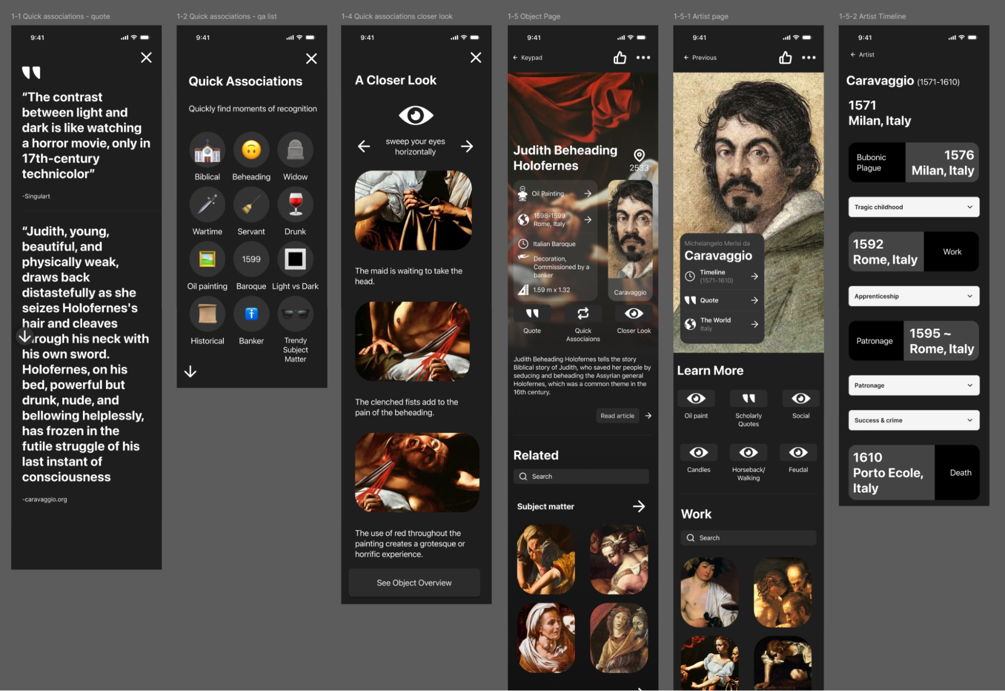
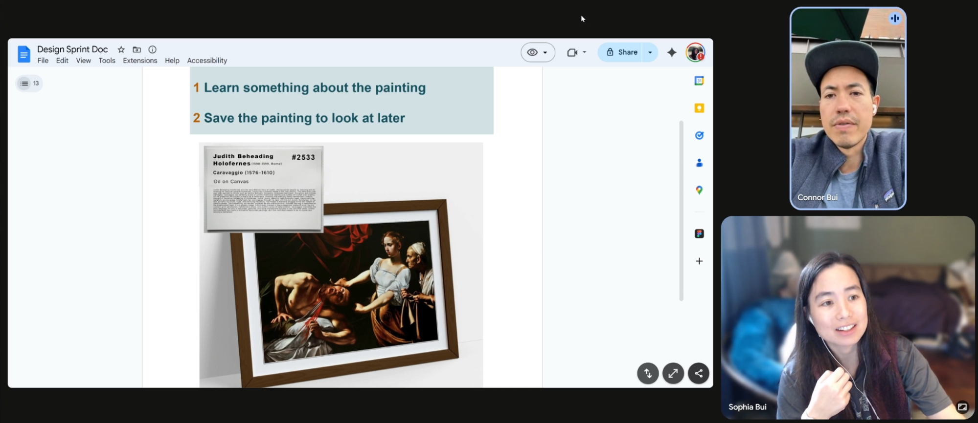
A really important component of this app was to essentially replace or help decipher the ubiquitous label/plaque that accompanies most object displays. My hypothesis is that the museum plaque isn’t helpful for museum visitors and contributes to museum fatigue and low or unfocused engagement, and therefore an app that spoonfeeds them key insights and instructs them on how to digest the content will result in better recall of information, understanding, and personal association which will result in a much more satisfying museum visit.
This November 2025, the design sprint was a flawed success.
Background
I began reading a book called “The Whole Picture”, which tells me about the ways in which museums hide hidden histories about the objects they put on display.
Soon after, I took a BiteSizeUX course which interviewed several museum-goers, and I learned about the poor experience some, if not many, museum goers deal with when exploring the many collections, and decided to tackle the issue.
Day 1
Research & Defining the Problem
Users are having difficulty engaging with and understanding the art they are consuming.
An interview with a museum docent reveals that “most people don’t know much and want to go on the tour to know more”, and “people can often come in with a blank slate".
“they’ll overlook something that seemed so simple at the time when i was sapling it and then they have a completely different reaction on their own””
Start at the end
Imagine a museum experience that will stay with you after you’ve left, and makes you feel connected to art, entertained and delighted by art, and that you understand the meaning behind what you saw. Imagine a museum experience that broadens your perspective and makes you feel culturally fulfilled.
How might we:
Help museum goers make the most of their visit?
Help users quickly get the context and meaning of an artwork?
Encourage users to look closely at the artwork?
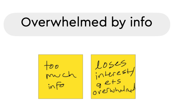
Give info without overwhelming the user?
Help people retain what they’ve seen during their experience?
Target
The critical moment is when the user walks up to an art piece, sees it and tries to read the plaque.
The critical user is a person who is a young adult, who likes museums, who uses a smart phone, and who has the ability to read, walk, see, and use their hands.
Possible Map for the end-to-end experience
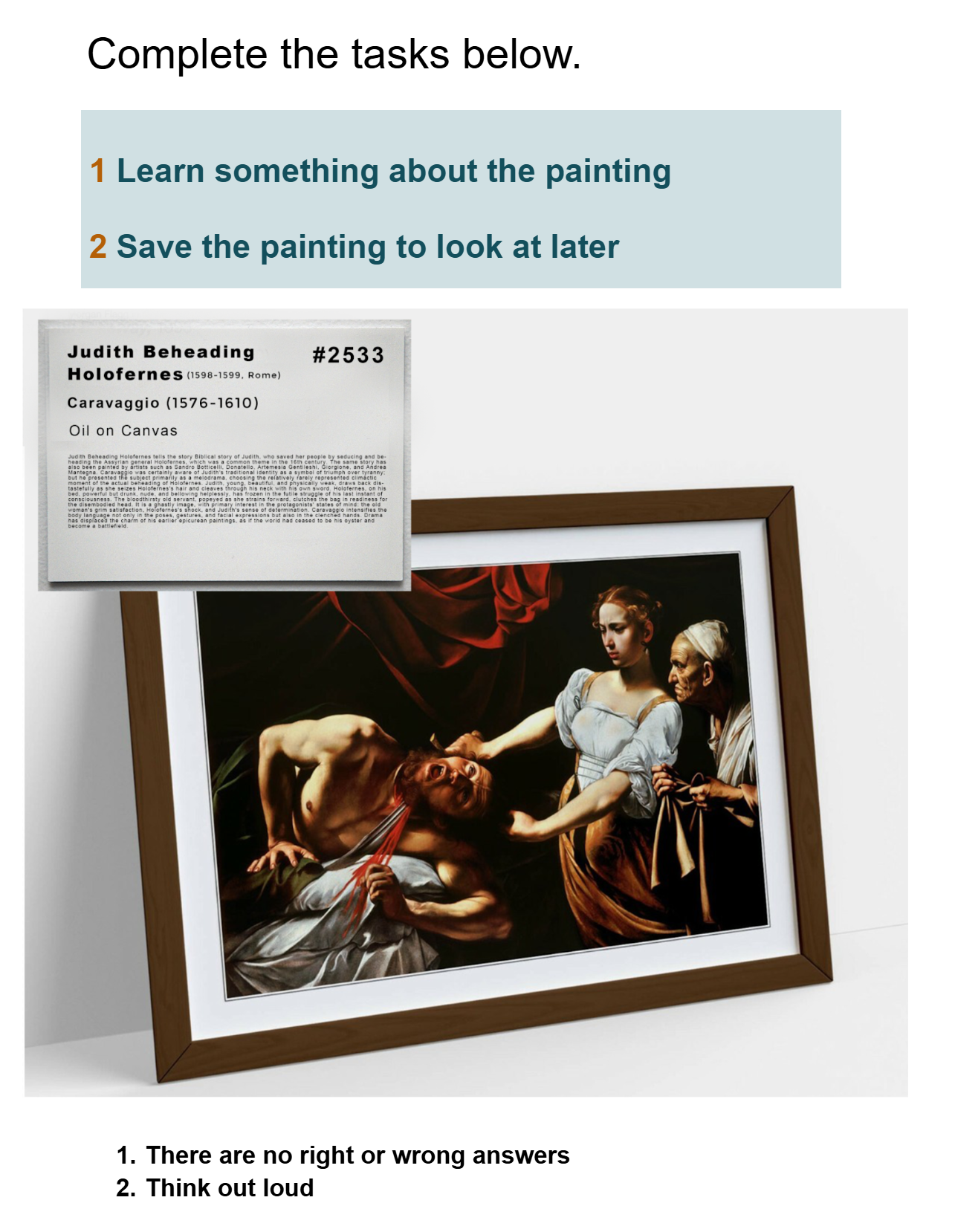
Goal 1: Learn something about the art
Goal 2: Save the art for later
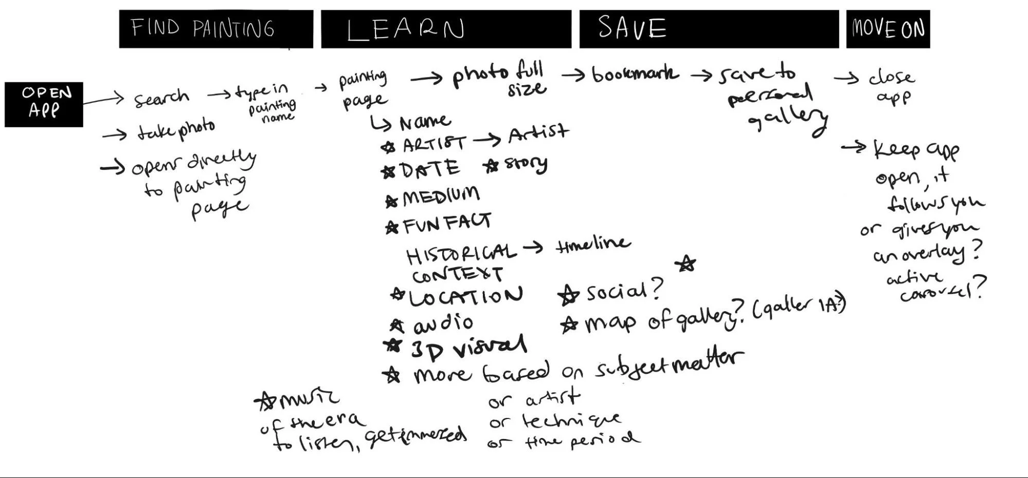
From all this, I started to come up with what would make a delightful experience, based off of everything I heard from interviewers and the docent.
Key aspects to a delightful experience:
Be able to impulsively capture an art piece
Find the work you’re looking at within seconds and learn one tidbit about it
Be able to interact with the artwork in a customized, minimalist way that is entertaining and immediate
Save the artwork so you can look at it later
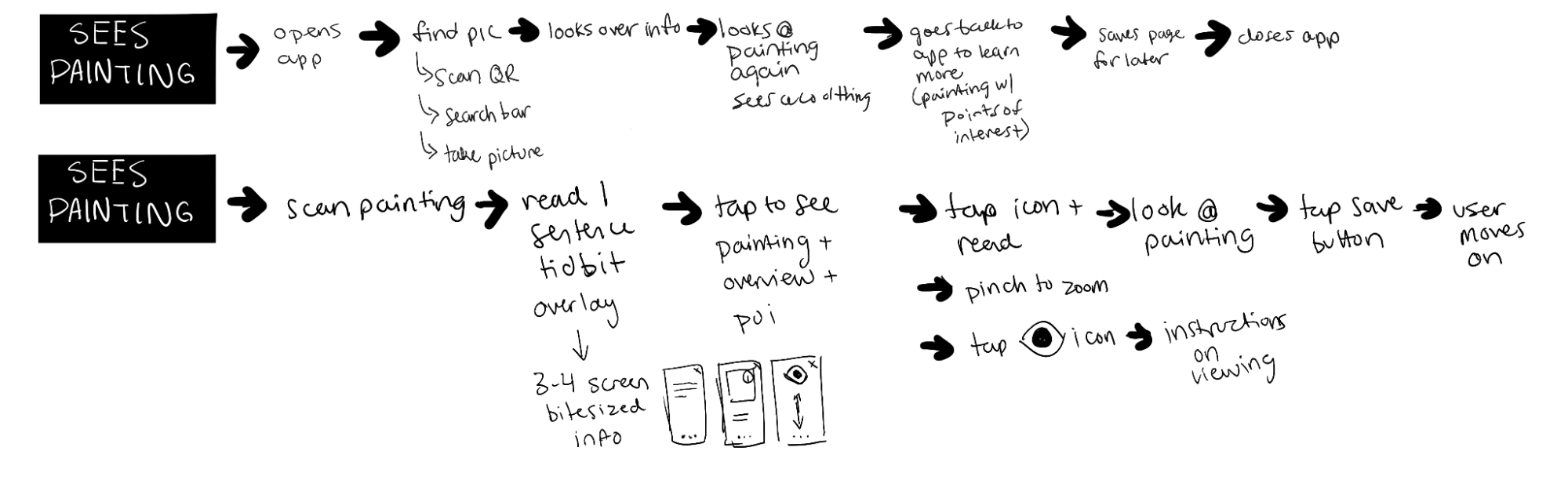
Journey Mapping
Day 2
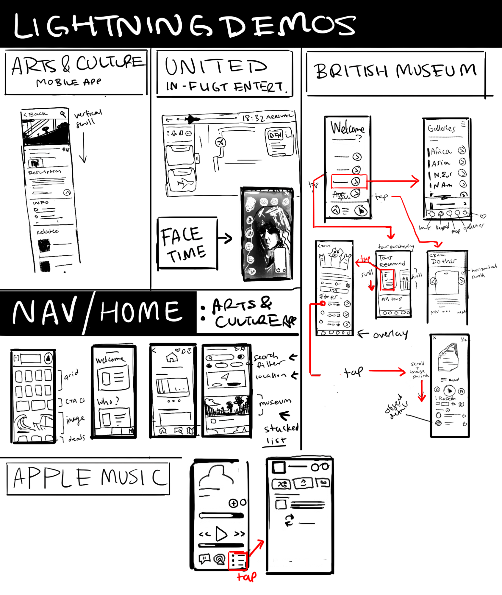
Competitive Analysis, Lightning Demos, & Information Architecture
Most gallery apps are for navigating the museum, and rely on audio guides to give people the story behind each installation.
Their solution was associated with more broad navigation as opposed to the understanding of individual art pieces, and the interaction users have with those pieces.
This was where I could help - create something that can help at the very moment of interaction between user and art, which can be from 5 seconds to one hour - people look at their favorite paintings longer, but if they’re in a rush, they might be looking at something for 2 seconds before rushing off to see the whole gallery.
Some of the interviews (See Usability Testing below) informed me that users never finish the museum. They “get stuck on one section and then run out of time and leave the museum”.
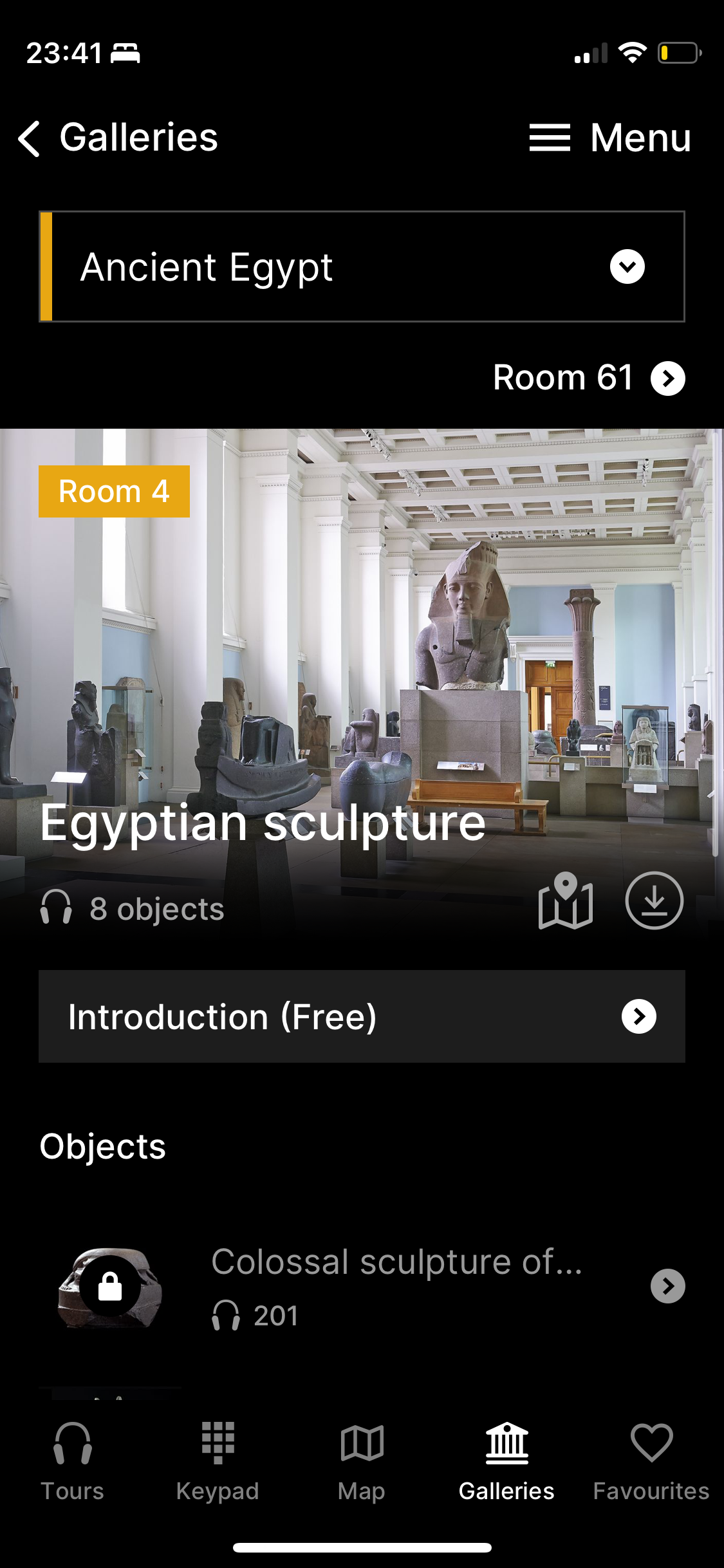
I studied and mapped out some of the common flows for the most popular museum visit apps, including the British Museum and Arts & Culture. For favoriting items, I looked at how Apple Music’s flows worked.
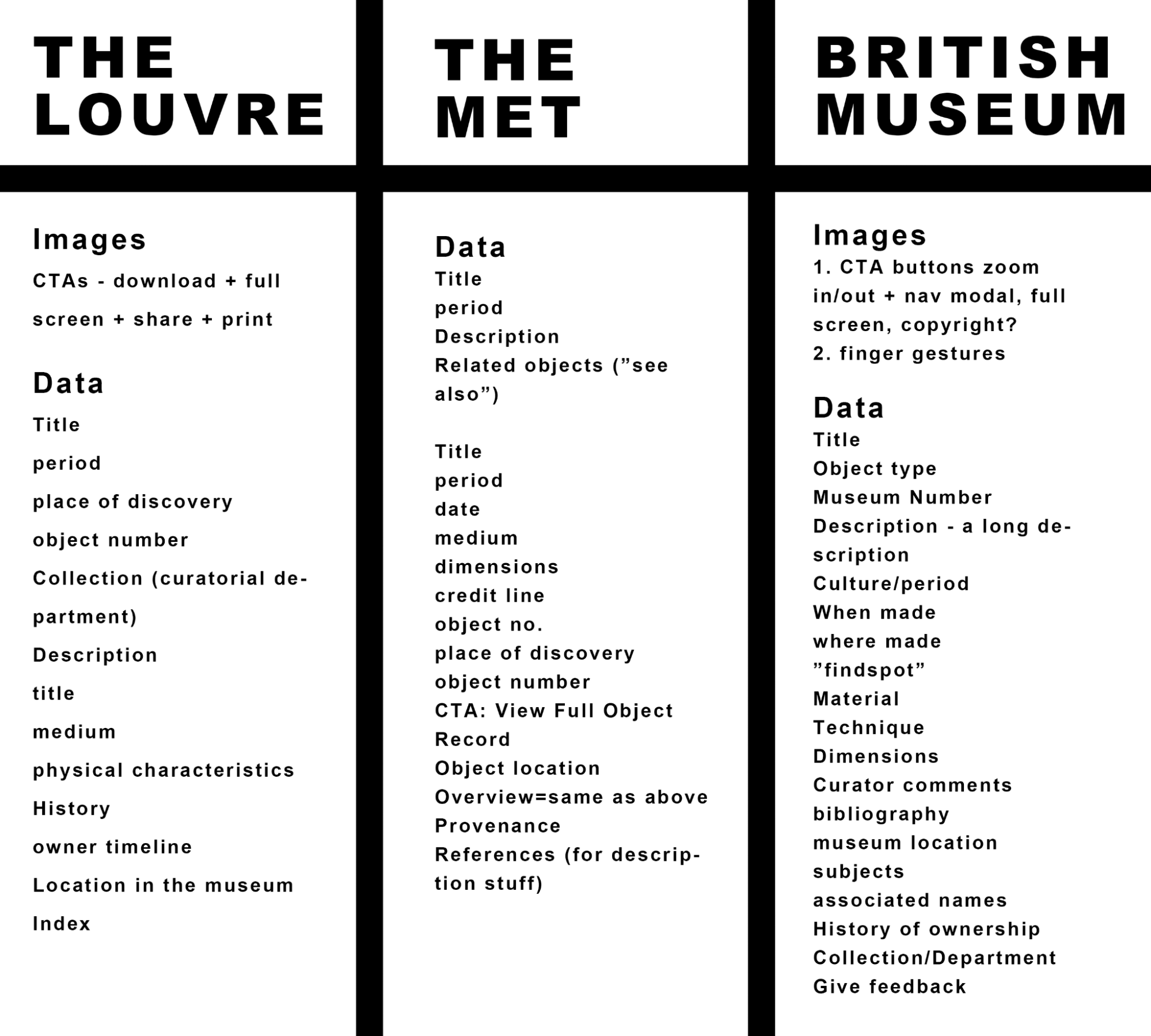
Deciphering the museum plaque information architecture was important o learn what information would be most available for the app, and many museum websites also categorize their objects in similar ways but with emphasis on certain components.
For example, the Louvre’s permanent objects are organized by purpose or medium (“Arms & armour”, “monuments/objects of worship”, “drawings and prints”)
The Met’s permanent objects (“The Met Collection”) is organized with multiple databases, and its website has a sophisticated filter that helps you find the art you’re looking for based on multiple data points (i.e. medium, era, date, artist, etc.)
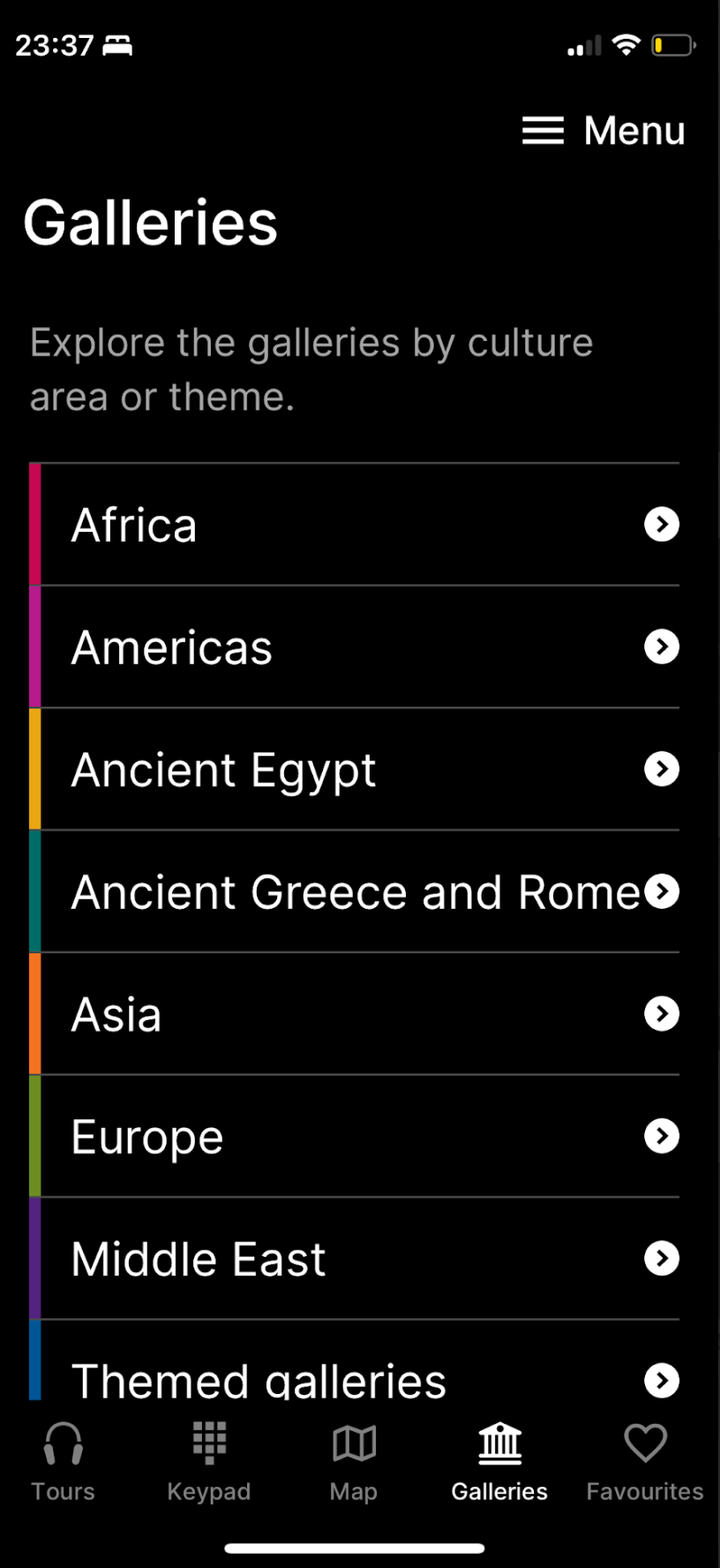
The British Museum’s permanent objects are organized by geography or era+geography (“Ancient Egypt”)
Workflow inspiration
Layout for the Object Page and Artist Page was a huge question, and so I sketched through layout options, but was mostly inspired by Snapchat, Facetime, Bumble, and Youtube Shorts, where you need quick information about the content plus quick action buttons like “end call” or “swipe left”, without distracting from the content itself which takes over the whole screen.
For the saving feature/adding to collection feature, I primarily used Apple Music’s playlist feature, which allows you to add any individual song to a playlist, or allows you to “favorite” it which adds to a favorite tab. This is easy and so I followed it basically to a T.
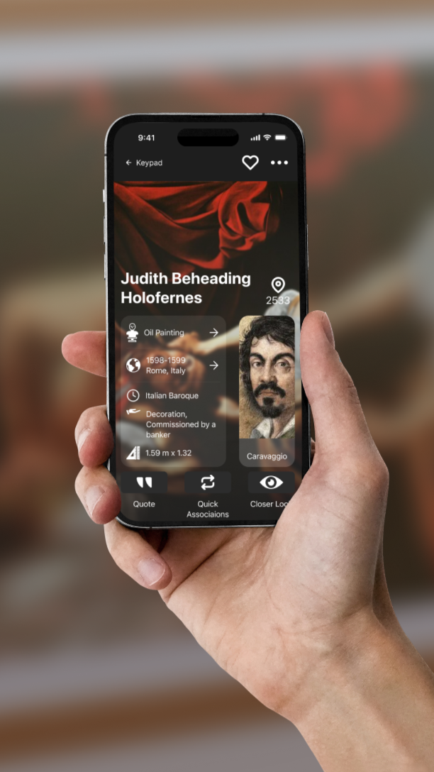
For the Methods section, I took inspiration from the British Museum app, which gives you its broadest categories in a simple vertical list. This is a clear info architecture that seems pretty standard for museums, and so the users will hopefully be able to find what they’re looking for using this list of “geography” or “medium”. The idea is to be able to know what it means to be “oil painting from Italian Baroque” - instead of just reading art history terms that mean nothing to you, you’ll be able to get the story behind those words in bite-sized increments.
Day 3
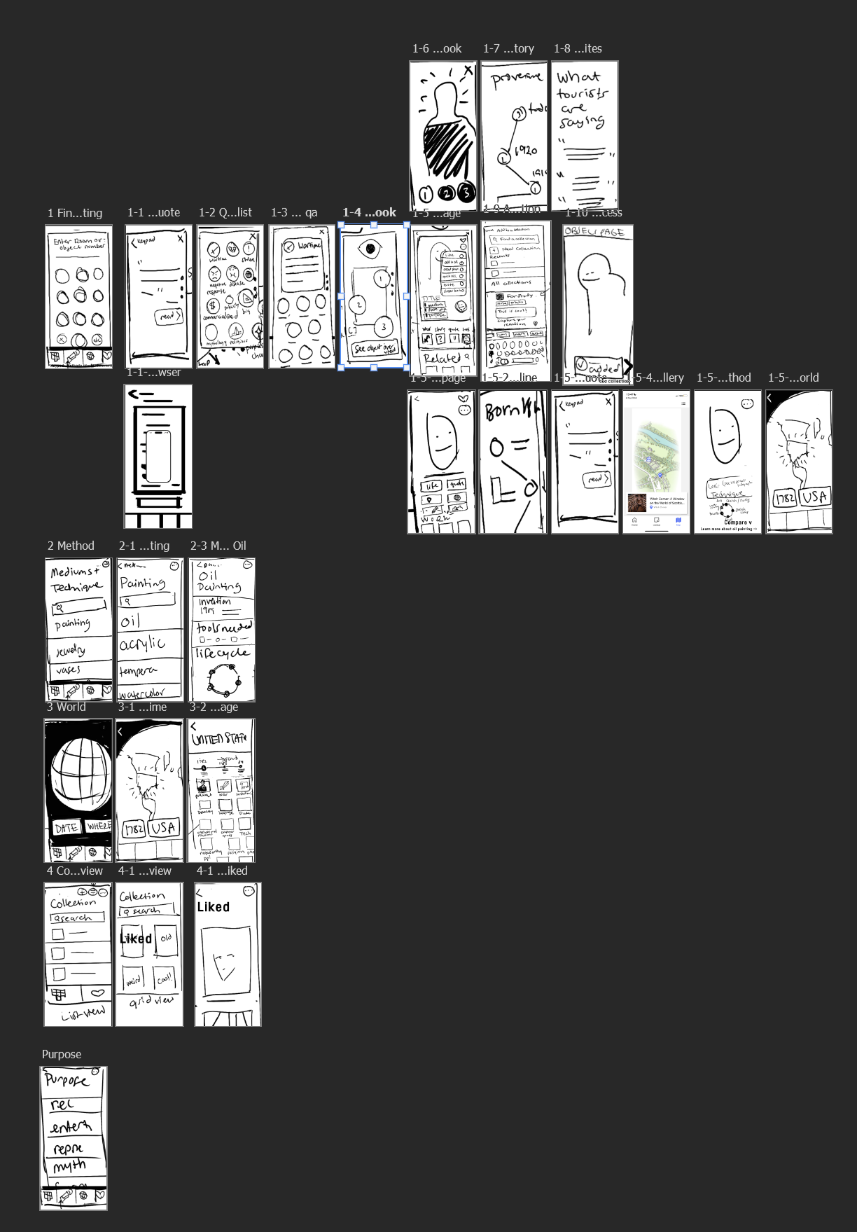
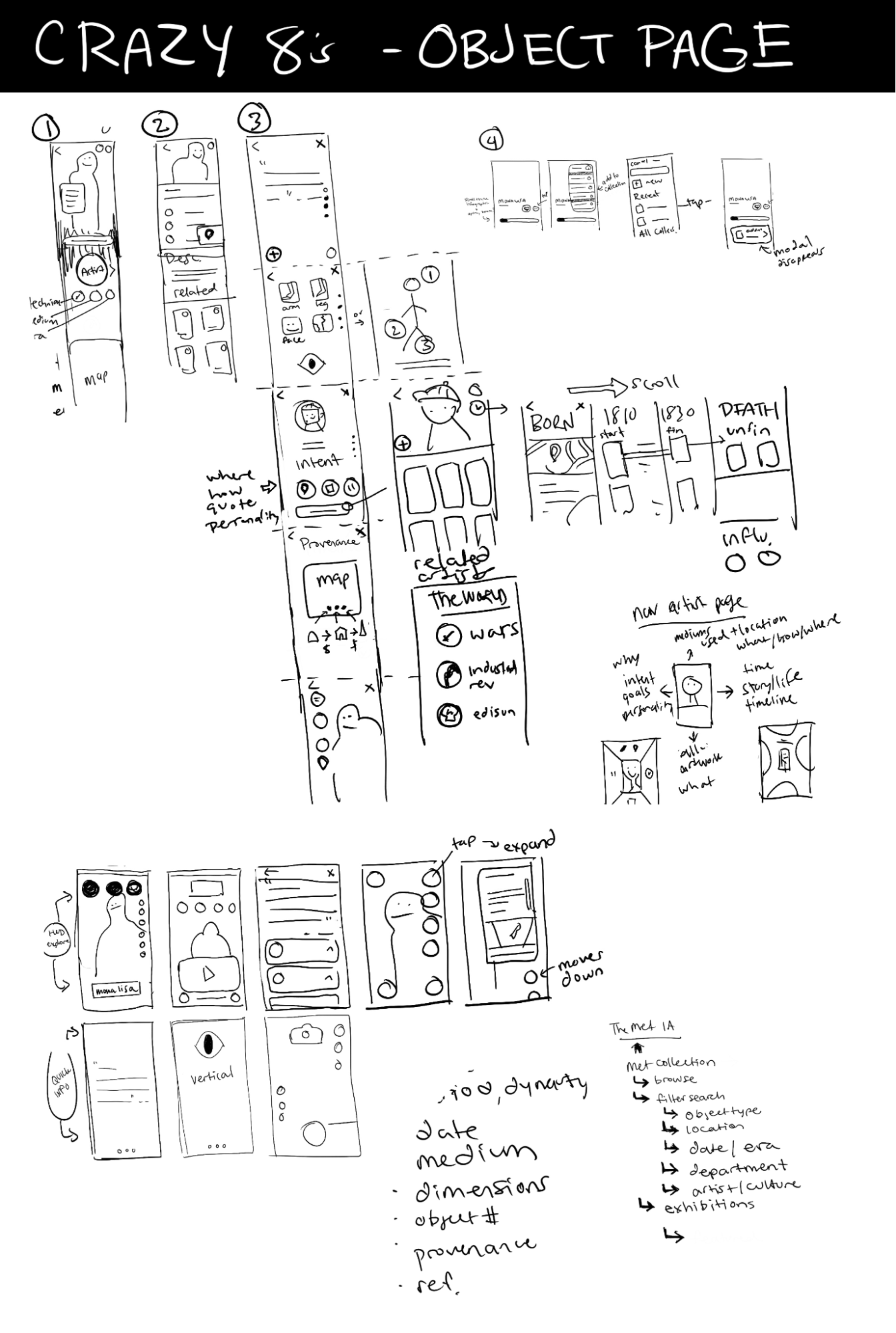
Crazy 8’s & Low Fidelity Sketches
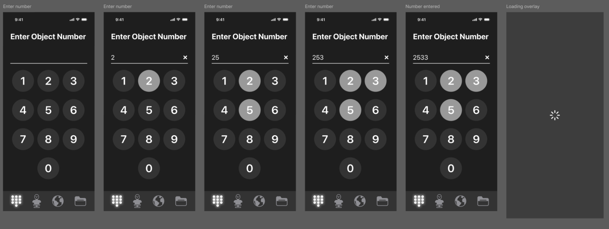
With my new found understanding of what other museums did to help users learn about their vast collections, I decided to focus specifically on the product page, and what it would offer.
Information Architecture
I spent a lot of time today reviewing what information needs to be on the object page
Title
Who made it
What is the subject and why was it made
When was it made
How was it made
How big is it
Who owns it
Day 4
High Fidelity Screens in Figma & Prototyping
Import to Figma
I took all my sketches including bits from my previous 4 days of work and constructed them into a workflow that I would then turn into my hi fi frames. I basically used these as lo fi screens and quickly tested their flows using Marvel’s free prototyping software.
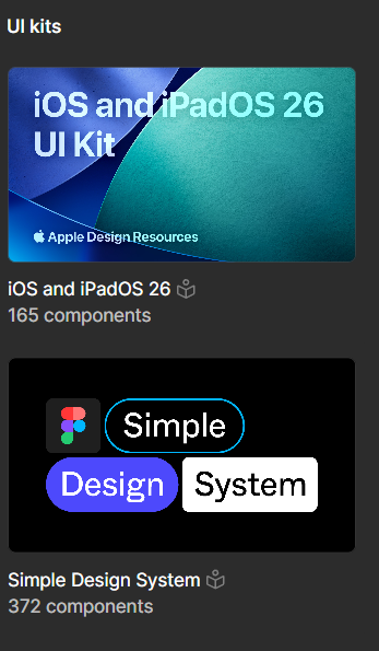
From there, I was ready to import to Figma, and laid them out to prepare for hi-fidelity prototyping using Figma’s built-in iOS 26 and Figma’s Simple Design System UI Kits.
When in doubt, Figma’s simplistic UI Design Kit was a god send.
I chose black with white text to make it visually calming and unstimulating. This is to be viewed in a curated lighting environment, so it needs to complement that.
Painting the scene:
A user might stare at a statue for a moment, glance at the label and read a few facts. They might even read through the whole description. This experience could take between 1-5 minutes, but the critical moments are within that first minute or so.
Day 5
Usability Testing
I met with users either over google meet or in person. Those who were over google meet used their desktop (except for one user who was tech savvy enough to download the Figma app) while those in person used my phone. I do not have remote users
Apps used
Google Meet
Google Docs
Figma Mobile App
Shared the Figma prototype link with users
OBS Studio for recording (for those users who do not want to use AI)
Otter (AI Notetaker) for recording, notetaking, summarizing
How user interacted with prototype
Phone
Desktop
Scenario
I tried to simulate the experience of being in front of a piece of artwork, to really focus in on that aspect of the museum journey. To do this, I told users (often based off of something they said about their life) to imagine they went to an art gallery, and had a few minutes to look at this artwork that they wanted to know more about.
“So this is a really useful. This is pretty cool.”
Results
We started off rough, with most people getting confused because I had originally designed the flow to go from entering information to getting specific. I learned that in order to help the users know where they are in the app, you want to go from high level (most general) to least general. So one small fix after 2-3 interviews, I improved the experience by making sure the user found their way first to the main painting page before going into the weeds of the interface.
We went from “it’s a bit clunky” to “that was a real treat!”
Another factor was the type of user. With my limited resources, my web developer friends were much less keen on exploring the app than others, and needed coaxing to move from screen to screen.
The art nerds were happily navigating the different subcategories and enjoyed cross-referncing different paintings.
“That was really cool. I really enjoyed that. That was really very fun.
Yeah, I keep seeing that painting. I’m like, Oh, I wonder what the story is behind that. And then I just keep walking.”
What I learned
Recurring issue
I added a feature kind of as an after thought that completely changed how the users interacted with the product: I added a CTA that took users to the article I was quoting. This caused all users to not search for the object page, but instead took them out of the app to an unhelpful plaque thereby causing the same problem they were already having with museums.
I learned 3 things
The first few seconds of an app experience will make or break their ability to stick to it.
For a learning app like this, give users the “home page” as quickly as possible
so they can see where they are and how they can get back.
Do not take lightly additional interactions I add during prototyping that were not thought through in site mapping/user mapping.
This is a prototyping activity I do - I’m brainstorming on the go instead of using my sketches that are more thought out workflows
“At this point in the design sprint, you have developed, refined, and eliminated a number of ideas. So don't give in to new ideas that might pop into the your head. Trust the process—only push forward with the ideas you've already refined.”
Thumbs up vs a heart icon vs a plus icon changes the interaction
Conclusion
Our goals were to
Make the in-person art museum experience more satisfactory by:
Help users broaden their perspective and make them feel culturally fulfilled
Help users feel connected to art, entertained and delighted by art, and feel meaning
As of November 11, 2025, the design sprint was a flawed semi-success.
People liked the object page and the categories available like “methods” and “world”
The navigation and saving features were flawed and not clear enough
The presentation of the information could have been more clear
Interactivity was not clear enough
For non-artists, the app was difficult to glean any meaning from - getting meaning through the app for these people was unsuccessful. They often felt like “so”? Or “why should I care”?
I am grateful for the design sprint, and hope to integrate it into every project I work on, because it helps me hit design deadlines, helps me be more specific, and is fast. It helps me feel relevant and empowered in a developer-powered, agile, fiscal quarter-based industry.