Arkhem Bikes
Designing Arkhem bikeshop’s desktop browsing and checkout experience
01
The Problem
Arkhem bikes’ recent data analysis showed that 50% of their customers abandon the site after looking at seven bikes, with an additional 70% abandon their cart at checkout. To determine the issues, we begin with two assumptions:
Customers are either overwhelmed or unsure about what bike is best for them
Customers experience friction due to the checkout requiring them to log-in
To verify my assumptions, I analyzed three industry leaders’ e-commerce checkout and browsing flows (Amazon, Target, and Trekbikes), sent out a survey, and interviewed target users (male, high-income) to determine their needs and how they interact with e-bike shops.
02
Analysis & Ideation
The results of my research found that cyclists’ care most about finding #1 the right type of bike, #2 the best deal, and #3 comfort (and fit).
By combining elements of the Amazon 3-step checkout process and the detailed bike page of both Canyon and Trekbikes, I produced wireframes the illustrate Arkhem’s new website, from browse to check-out, including a helpful comparison feature which allows users to quickly assess the many features of their choices.
03
Hi-Fi Design & Validation
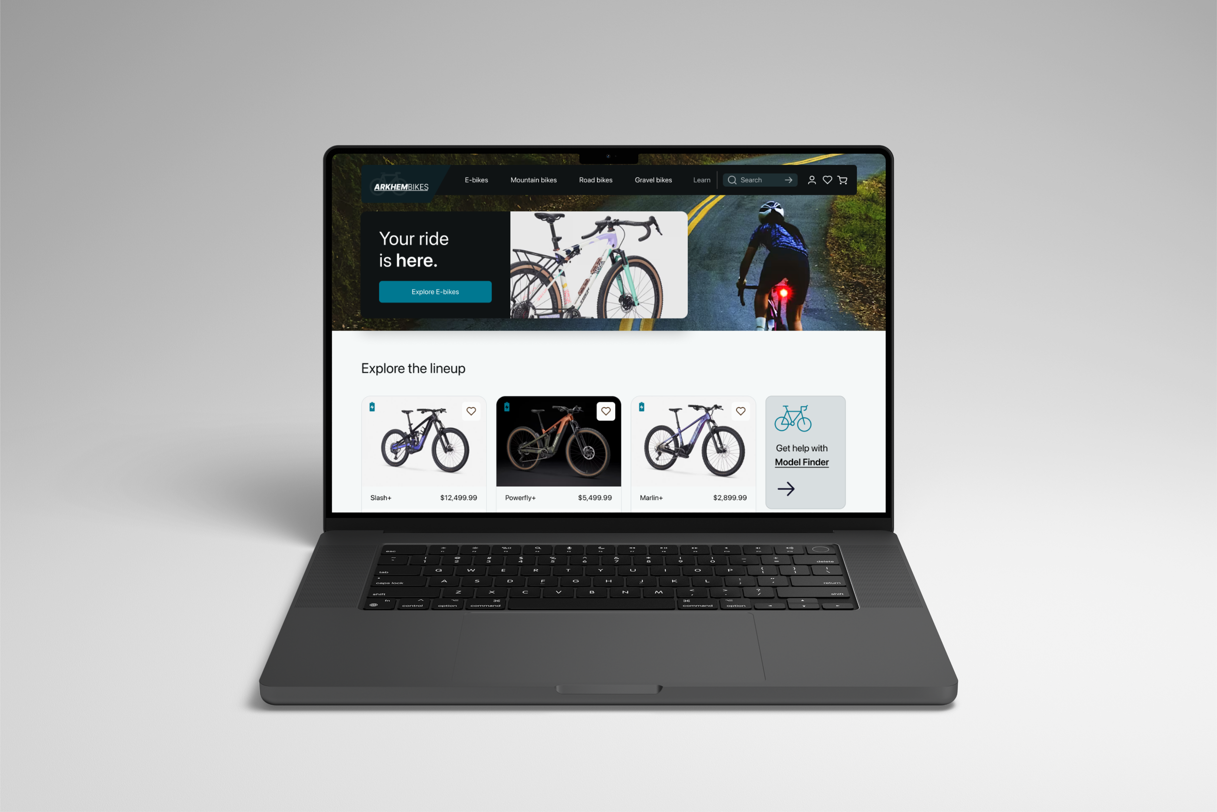
I produced a functional prototype that allows a user to browse, compare, and purchase a bike.
I tested out the prototype and interviewed 4 passionate cyclists who were looking to purchase a new bike who reported that they enjoyed the aesthetics of the website and found the photography to be compelling and interesting, and had a 100% success rate at checkout.
Industry leader analysis | User Survey | Interviews | Research Synthesis
Discover
The purpose of the “Discover” phase of my design process is to define the problem, understand and empathize with the target user, and get familiar with the industry. Because this was my first e-commerce website design, I both needed to embody the most important industry standards of e-commerce and educate myself on the passionate detail-oriented world of the cyclist. By using e-commerce best practices (see Baymard’s excellent list here), we reduce cognitive and decision fatigue for the user and thus increase the probability of successful task completion. My knowledge of the cycling community was close to zero, so the user interviews and web research was imperative to empathize correctly with these detail-oriented users.
Industry Leaders in E-commerce
-
Trekbikes.com
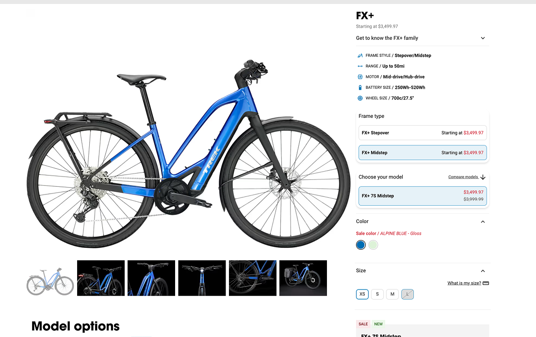
Has a very strong bike product page, with a 2:1 layout which gives you basic specs about each bike, and highlighst what their users care most amount, which I used as the basis for the level of detail Arkhem bikes should be addressing, and in what order.
Their landing pages did not lead to a lucrative browsing experience, and is tailored to casual riders, which would delineate from my target user, but is a leader in the e-commerce bike space.
-
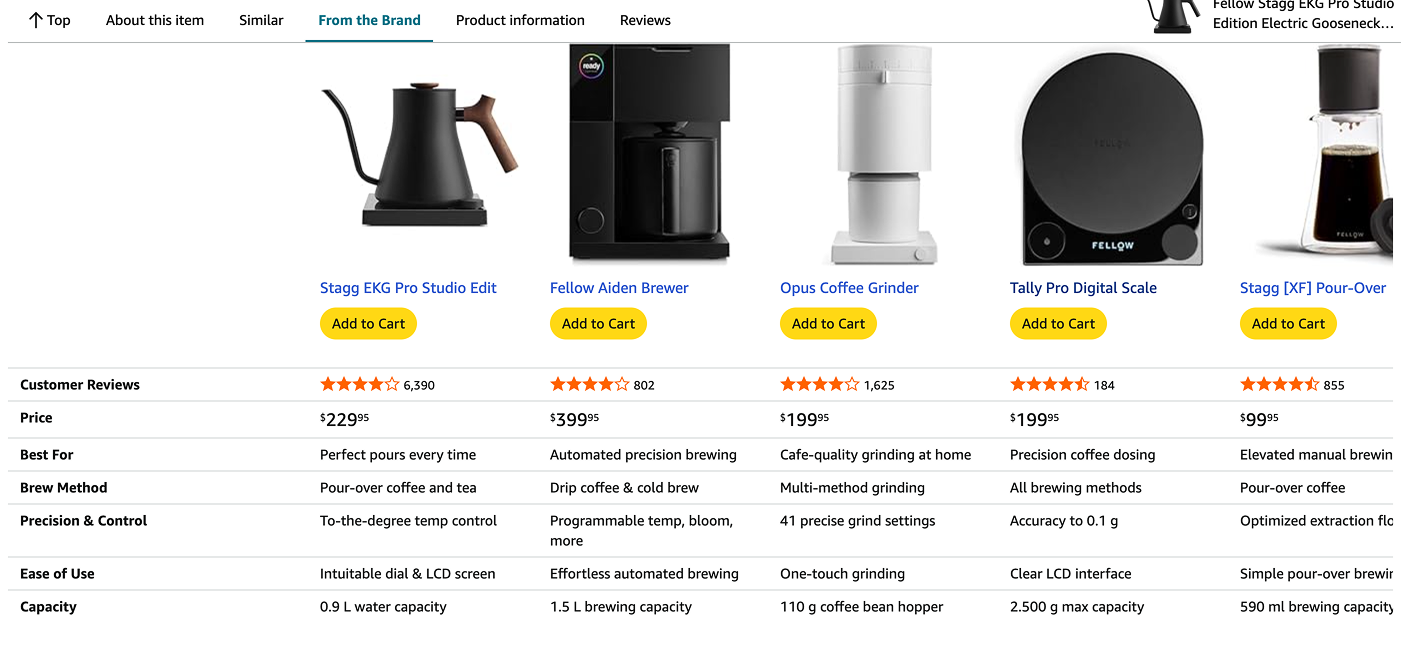
Amazon
Amazon’s browsing and checkout process is unmatched in its flexibility of categorized search features, and has a very quick 2-3 step checkout process, which reduces friction from cart to purchase. These features inspired my checkout process, and inspired the layout for the Arkhem landing page.
-
Canyon Bikes
Canyon Bikes differs from Trekbikes in its more niche target audience, featuring much more customization features, yet maintains a similar layout to other bike websites, which I explored as an industry standard. This helped solidify the layout and UI for the Arkhem design.
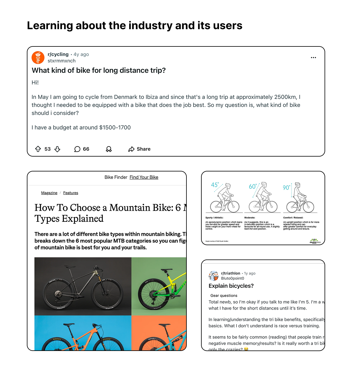
Secondary Research
Internet Queries and Online Forums
I found that doing a simple search query brings up millions of helpful links and social media content about how to choose a bike, which brands are best, and what to look for. I also did some looking into the stats of e-commerce bike buying, which brought up that it is a rising trend, especially for e-bikes.
By looking through multiple “how to choose a bike” blog posts and websites, Reddit threads, and other bike website industry leaders, I discovered a list of the main factors which users tend to categorize and identify their bike needs:
Where do you want to ride
Users first must asked the WHERE (i.e. What types of terrain, flat vs hilly)
How do you want to ride
Users then are asked the HOW (i.e. how long are you riding? Are you racing or riding casually?)
What fits your body and lifestyle?
Extras
Users then might want to know about mounting, best practices, maintenance tips, and other nice-to-haves.
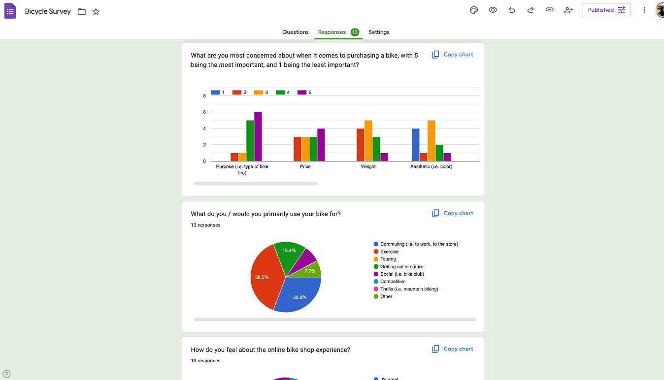
User Surveys and Interviews
After researching I reached out to my network of friends and family, to get both quantitative and qualitative data about my users. One thing that surprised me was that many Santa Cruz bikers refuse to use use e-bikeshops because of their belief test-riding as the best method. An important challenge would be to help users feel as confident about the fit and comfort of their bike.
-
Price, Type of bike, Comfort, Material are the most important thing to users, and trumped aesthetics, country of origin, and brand which was surprising considering how many users seem to gravitate to certain brands (i.e. Specialized or Trek).
-
70% of survey responses indicated that in-person bike-shop advice and friends/family reviews were how they get bike recommendation. Half of users learn online about bikes through search queries and forums, but most definitely will go to see an expert before purchasing.
-
50% of users are very careful about their purchase and do not buy easily - they look at all their options and have many avenues before they feel confident in buying. It’ll be important to have a comparison button to help users see the difference between models.
Research Synthesis | Sketching | Wireframing
Ideating & Design
The second phase of my design process is to take everything I learned from my research and turn what I learned into actionable insights known as “Jobs to be Done”, and to establish the best way to accomplish my goal of improving the browsing and checkout processes.
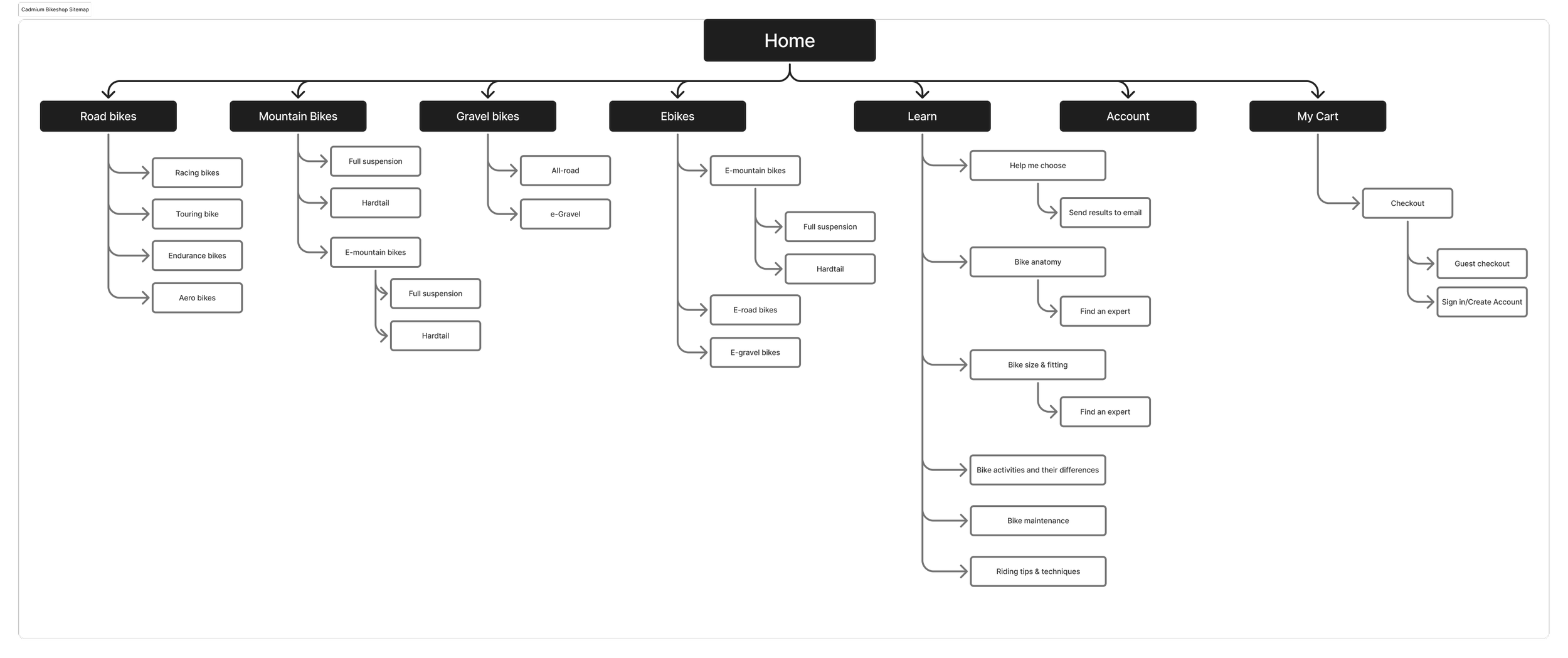
Sitemapping and Information Architecture
Industry standard suggests that users look first for purpose or the terrain they will ride. Therefore, the sitemap reflects the specific bike type associated with each terrain.
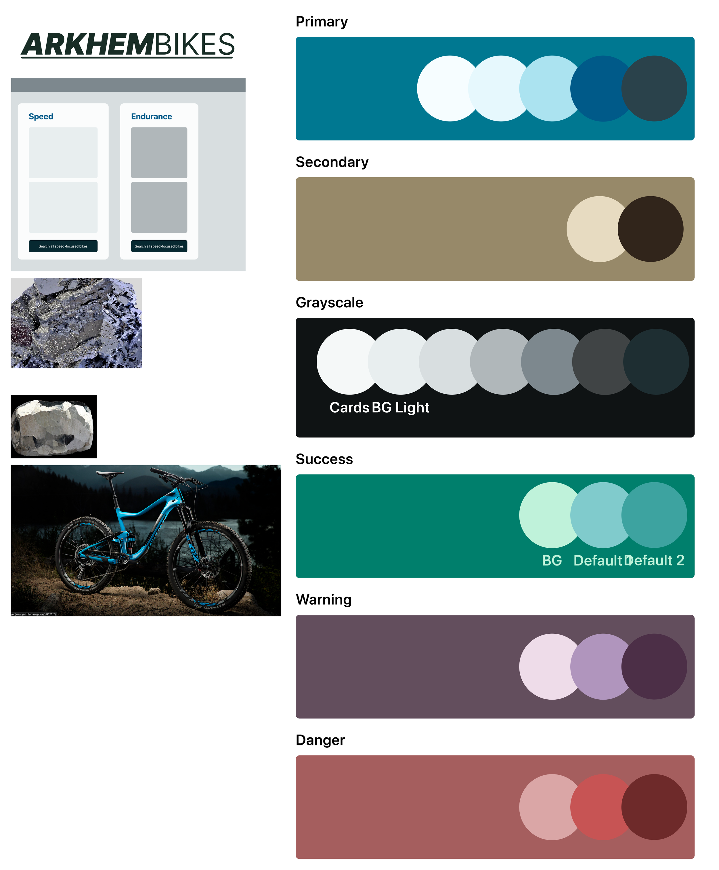
Branding & Component Design
Because my user base is male-dominated, and is an arduous process of research and detail-oriented work, I chose a color palette that is calming with a connotation of trustworthiness and professionalism.
Hi Fidelity Prototyping | User Testing | Reiterating and Retesting
Validation
This final step in my design process which can be reiterated on is about testing my prototype to see if I’ve succeeded in solving the problem for customer conversion rates. In this case, I tested individuals who had responded to my user survey to see if they could accomplish two tasks:
Task 1: Discover a bike you like
Task 2: Purchase that bike.
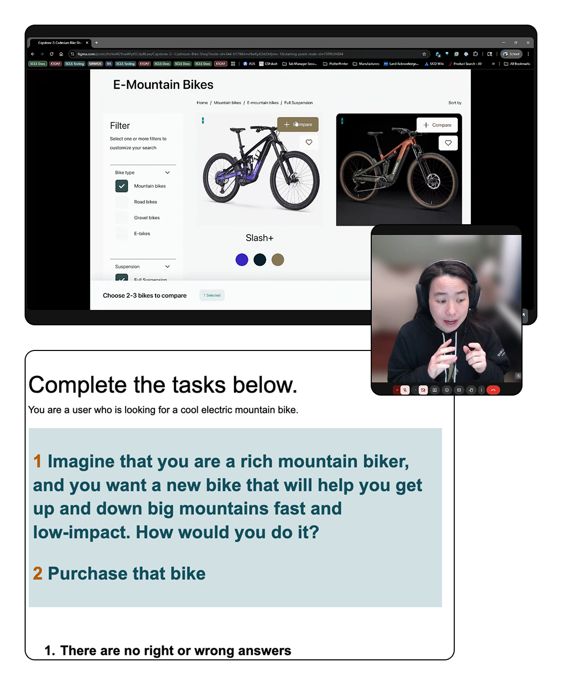
User Testing
Users found the website was really pleasing to look at, and responded positively to the high-quality images.
Users expressed enjoyment of the comparison button, and were very happy to read over the product page. However, users had difficulty discovering the user reviews and at least two users were concerned about the weight of the bike.
100% of users successfully completed task 2.